
Interior Colour Ideas for Your Home: Stylish Ways to Choose the Right Colours

Choosing the right interior colours can completely change how a home looks and feels. Colour influences the mood of a room, affects how large or intimate it appears, and can bring furniture, lighting, flooring, and wall décor together.
The best interior colour ideas are not necessarily the boldest ones. A successful colour scheme considers the amount of natural light, room size, existing materials, furniture, and the atmosphere you want to create.
Whether you prefer a calm white interior, warm beige and wood tones, sophisticated grey, dramatic black, relaxing blue, or a colourful modern home, the key is to create balance.
This guide explores practical interior colour ideas for every part of your home, including living rooms, bedrooms, kitchens, dining areas, offices, and smaller spaces. You will also learn how to combine colours, choose wall colours, use accent shades, and coordinate artwork with your interior palette.
What Are Interior Colours?
Interior colours are the shades and combinations used throughout a home’s walls, ceilings, furniture, flooring, textiles, accessories, and decorative elements.
They can include:
- Wall paint colours
- Ceiling colours
- Furniture colours
- Accent colours
- Wood tones
- Flooring colours
- Curtain and upholstery colours
- Decorative accessories
- Artwork and wall décor
A good interior colour scheme usually contains a combination of dominant, supporting, and accent colours rather than treating every surface independently.
For example, a living room might combine warm white walls, natural wood furniture, beige upholstery, and blue artwork. The result feels coordinated without making every element the same colour.
20 Interior Colour Ideas for a Beautiful Home
1. Create a Warm Neutral Interior
Warm neutrals are one of the easiest ways to create a comfortable and timeless home.
Consider shades such as:
- Warm white
- Cream
- Beige
- Sand
- Taupe
- Soft greige
These colours work particularly well with natural wood, linen, woven textures, and artwork with earthy tones.
If you want a home that feels sophisticated without becoming visually overwhelming, a warm neutral palette is an excellent starting point.
2. Use White for a Fresh and Spacious Look
White interior design can make rooms feel clean, bright, and open.
However, not every white looks identical. Cool whites can feel crisp and contemporary, while warm whites create a softer atmosphere.
Use warm white when you have:
- Wooden furniture
- Warm lighting
- Beige textiles
- Brass or gold details
- Natural materials
White walls can also provide an excellent background for colourful or dramatic wall art.
3. Try Sophisticated Grey
Grey interior design can range from pale and understated to deep and dramatic.
Light grey works well in bedrooms, living rooms, and offices where you want a neutral backdrop. Darker charcoal shades can create a stronger feature wall or sophisticated focal point.
Grey pairs particularly well with:
- White
- Black
- Natural wood
- Blue
- Green
- Brass
- Cream
The key is to introduce texture so that a grey room does not feel flat.
4. Add Blue for a Calm Atmosphere
Blue is particularly effective when you want a room to feel calm and relaxing.
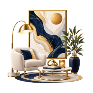
Soft blue works beautifully in bedrooms, while navy and deeper blue can create a sophisticated living room or office.
Combine blue with white for a fresh look or with warm wood and beige for a more comfortable atmosphere.
Blue artwork can also reinforce the palette without requiring blue on every wall.
5. Use Green to Bring Nature Indoors
Green interior colours can make a room feel connected to nature.
Depending on the shade, green can create very different moods:
- Sage green — soft and calming
- Olive green — earthy and sophisticated
- Forest green — dramatic and rich
- Moss green — natural and understated
Green works especially well with wood, cream, stone, rattan, and botanical artwork.
6. Introduce Earthy Terracotta
Terracotta adds warmth and personality without being as intense as some brighter colours.
Use it through:
- Accent walls
- Cushions
- Ceramics
- Rugs
- Artwork
- Decorative accessories
Terracotta is particularly effective in Mediterranean, rustic, modern rustic, and earthy contemporary interiors.
7. Combine Beige with Natural Wood
Beige and wood create one of the most versatile interior colour combinations.
The softness of beige balances the visual warmth of timber, while different wood tones introduce natural variation.
This palette works particularly well for:
- Living rooms
- Bedrooms
- Dining areas
- Modern apartments
- Scandinavian-inspired homes
Add black accents or darker artwork if the room needs stronger contrast.
8. Create a Black and White Interior
Black and white interiors provide strong contrast and a timeless appearance.
Instead of making the entire room black and white, use different textures to add depth.
For example:
White walls + black furniture + natural wood + black-and-white artwork
This combination works particularly well in modern, contemporary, minimalist, and industrial interiors.
9. Use a Monochromatic Colour Scheme
A monochromatic scheme uses different shades of one primary colour.
For example, a blue room might contain:
- Pale blue walls
- Medium blue upholstery
- Navy cushions
- Blue artwork
This creates visual consistency while allowing different shades to provide depth.
10. Add a Muted Colour Accent
If you prefer neutral interiors, you do not need to introduce several strong colours.
Choose one muted accent such as:
- Dusty blue
- Sage
- Terracotta
- Mustard
- Olive
- Blush
Use it selectively in artwork, cushions, curtains, rugs, or a feature chair.
11. Use the 60-30-10 Colour Rule
The 60-30-10 rule is a useful starting point for balancing interior colours.
A typical scheme uses:
- 60% — dominant colour
- 30% — secondary colour
- 10% — accent colour
For example:
60%: warm white walls and large surfaces
30%: beige furniture and textiles
10%: blue artwork and accessories
This does not need to be mathematically exact. Think of it as a visual guide rather than a strict decorating rule.
12. Make the Ceiling Part of the Colour Scheme
The ceiling does not always have to be pure white.
A very pale version of the wall colour can create a softer, more enveloping appearance.
For a dramatic room, a darker ceiling can also work, particularly when the room has sufficient height and natural light.
13. Create a Feature Wall
A feature wall is an easy way to introduce stronger colour without committing the entire room to it.
Good locations include:
- Behind the bed
- Behind a sofa
- Dining room focal wall
- Home office backdrop
- TV wall
Choose a wall that already functions as a natural focal point.
14. Match Colour with Natural Materials
Interior colours become more interesting when combined with materials.
Consider:
Warm white + oak + linen
Sage + walnut + stone
Terracotta + natural wood + cream
Navy + white + brass
Charcoal + concrete + timber
Materials prevent colour schemes from feeling too flat or artificial.
15. Use Colourful Artwork Instead of Colourful Walls
If you prefer neutral walls, artwork can provide the strongest colour accent in the room.
A neutral living room with a large colourful painting can feel much more dynamic without repainting the walls.
This approach is particularly useful when you want flexibility because artwork can be changed more easily than paint.
16. Create a Soft Bedroom Colour Palette
Bedrooms usually benefit from quieter interior colours.
Consider:
- Warm white
- Beige
- Greige
- Dusty blue
- Sage
- Soft pink
- Taupe
Combine these colours with layered textiles and warm lighting to create a comfortable environment.
17. Use Stronger Colours in Small Doses
Bold colours can work beautifully when used selectively.
Instead of painting an entire room bright yellow, red, emerald, or cobalt, introduce the colour through:
- Artwork
- Accent furniture
- Cushions
- Curtains
- Decorative objects
- A small feature wall
This creates personality while maintaining balance.
18. Coordinate Colours Across Open-Plan Spaces
Open-plan homes need a colour scheme that works across connected areas.
You do not need every room to use exactly the same colour. Instead, repeat one or two colours throughout the space.
For example:
Living room: beige + blue
Dining area: beige + blue + wood
Kitchen: white + wood + blue accessories
The repeated colours create visual continuity.
19. Use Dark Colours to Create Depth
Dark interior colours can make a room feel sophisticated and intimate.
Try charcoal, deep green, navy, chocolate brown, or black on:
- Feature walls
- Built-in cabinetry
- Doors
- Shelving
- Furniture
- Small accent areas
Dark colours are especially effective when balanced with lighter surfaces and sufficient lighting.
20. Let Your Artwork Guide the Colour Palette
If you already have a favourite painting, use it as a colour reference.
Identify two or three colours within the artwork and repeat them subtly around the room.
For example, if a painting contains:
Cream + olive + terracotta
You could use:
- Cream walls
- Olive cushions
- Terracotta accessories
- Natural wood furniture
This creates a more intentional relationship between the artwork and the interior.
Interior Colour Ideas by Room
Different rooms serve different purposes, so their colour schemes can also be different.
Living Room Interior Colours
The living room is usually the most flexible space for experimenting with colour.
Popular combinations include:
- Beige + cream + wood
- Grey + white + black
- White + blue + natural wood
- Green + beige + brass
- Terracotta + cream + brown
If the living room has a large empty wall, consider using artwork as the main accent rather than adding several competing decorative colours.
Bedroom Interior Colours
Bedrooms generally benefit from calming colour palettes.
Try:
- Warm white + beige
- Sage + cream
- Dusty blue + white
- Taupe + warm white
- Soft grey + natural wood
For a more luxurious bedroom, combine deeper shades with textured fabrics and carefully selected lighting.
Kitchen Interior Colours
Kitchen colour choices should work with cabinetry, countertops, backsplash materials, and appliances.
Popular combinations include:
- White + wood
- Greige + oak
- Sage + cream
- Navy + white
- Charcoal + timber
- Beige + stone
If the kitchen is small, lighter colours can help maintain an open appearance.
Dining Room Interior Colours
Dining rooms can handle stronger colours because they are often designed around a specific atmosphere.
Consider:
- Deep green
- Navy
- Terracotta
- Warm beige
- Charcoal
- Burgundy accents
Artwork can provide an additional focal point above a dining console or sideboard.
Home Office Interior Colours
A home office should feel focused without becoming sterile.
Good options include:
- Soft grey
- Warm white
- Beige
- Sage green
- Muted blue
- Deep green accents
If the office needs personality, introduce colour through artwork, books, furniture, or accessories.
Drawing Room Interior Colours
Formal drawing rooms can support richer and more sophisticated palettes.
Try:
- Cream + gold + wood
- Beige + brown
- Navy + cream
- Deep green + brass
- Charcoal + warm white
The right artwork can reinforce the room’s colour story while becoming a focal point.
Puja Room Interior Colours
Puja spaces generally work well with peaceful, warm colours.
Consider:
- Cream
- Off-white
- Light beige
- Soft yellow
- Natural wood
- Subtle earthy tones
Avoid excessive visual contrast if the goal is to create a calm and uncluttered atmosphere.
How to Choose the Right Interior Colours
Choosing colours becomes easier when you work through the room systematically.
1. Start with Natural Light
Observe the room at different times of day.
A room with strong sunlight can usually handle deeper or cooler shades. A darker room may benefit from lighter, warmer colours.
2. Consider the Room Size
Light colours can make smaller spaces feel more open.
That does not mean dark colours should be avoided in small rooms. A carefully chosen dark feature wall can create depth and character.
3. Look at Existing Materials
Do not select wall colours before considering permanent elements such as:
- Flooring
- Kitchen cabinets
- Countertops
- Woodwork
- Stone
- Doors
- Large furniture
Your paint colour should work with these existing materials.
4. Choose Furniture Before Finalising Accent Colours
Large furniture occupies more visual space than accessories.
If you already have a large brown sofa, for example, your wall and accent colours should complement it rather than compete with it.
5. Test Colours Before Painting
Paint samples can look completely different depending on lighting.
Test your preferred colours on the actual wall and observe them during:
- Morning
- Afternoon
- Evening
- Artificial lighting
This simple step can prevent expensive mistakes.
Interior Colour Combinations That Work Well
Here are some versatile combinations to consider:
| Colour Combination | Overall Feel | Works Well In |
| White + Wood | Fresh and warm | Living room, kitchen |
| Beige + Cream | Soft and elegant | Bedroom, living room |
| Grey + White | Contemporary | Office, living room |
| Blue + White | Calm and fresh | Bedroom, living room |
| Sage + Beige | Natural | Bedroom, living room |
| Green + Wood | Organic | Living room, dining |
| Navy + Cream | Sophisticated | Drawing room, office |
| Terracotta + Cream | Warm and earthy | Living room, dining |
| Black + White | Dramatic | Modern interiors |
| Charcoal + Wood | Industrial | Living room, office |
How Interior Colours Work with Wall Art
Colour and wall art should support one another rather than compete.
If your walls are neutral, colourful artwork can become the main visual statement.
If your walls already have a strong colour, choose artwork that contains at least one related or complementary shade.
For example:
Sage wall + artwork containing cream and earthy green
or
Warm white wall + colourful abstract artwork
or
Charcoal feature wall + light-toned artwork
The goal is not to match every colour exactly. Repeating a colour subtly is usually enough to create cohesion.
For more ideas, explore Canvasora’s guides to Modern Wall Art Ideas →, Colourful Wall Art →, Black and White Wall Art →, and Living Room Wall Art Ideas →.
Interior Colour Ideas for Different Interior Styles
Colour can also help establish a specific design style.
Modern Interior Colours
Modern homes often use:
- White
- Grey
- Beige
- Black
- Natural wood
- Restrained accent colours
Minimalist Interior Colours
Minimalist interiors typically favour:
- White
- Cream
- Beige
- Soft grey
- Natural wood
- Muted earthy tones
Scandinavian Interior Colours
Scandinavian spaces often combine:
- White
- Pale grey
- Beige
- Light wood
- Soft blue
- Muted green
Rustic Interior Colours
Rustic interiors work well with:
- Brown
- Beige
- Cream
- Terracotta
- Olive
- Warm grey
Luxury Interior Colours
Luxury interiors can incorporate:
- Cream
- Taupe
- Deep green
- Navy
- Charcoal
- Black
- Gold or brass accents
Contemporary Interior Colours
Contemporary interiors often combine neutral foundations with carefully selected stronger accents.
Deep blue, green, charcoal, terracotta, and warm wood can all work effectively.
How to Make Your Interior Colours Look More Expensive
A premium interior does not require dozens of colours.
Instead, focus on:
Limit the Main Palette
Three to five closely related colours are often enough for an entire room.
Repeat Colours
Repeat a shade in at least two or three places.
For example, if your artwork contains blue, repeat blue through a cushion, vase, or rug.
Add Texture
Use linen, wood, stone, metal, wool, glass, and woven materials to give simple colours more depth.
Balance Warm and Cool Shades
A cool grey room can become more comfortable with warm wood. A warm beige room can gain definition through black or charcoal accents.
Avoid Excessive Matching
Everything does not need to be the same colour. A sophisticated room usually has variation within a controlled palette.
Interior Colour Mistakes to Avoid
Using Too Many Colours
Too many unrelated colours can make a room feel visually chaotic.
Start with a simple palette and introduce accents gradually.
Choosing Paint Before Furniture
Paint is easier to change than flooring, cabinetry, sofas, or large furniture.
Consider the permanent elements first.
Ignoring Lighting
A colour that looks beautiful in a bright showroom may appear completely different in your home.
Always test colours under your actual lighting.
Making Every Room Identical
A whole home should feel connected, but each room can have its own personality.
Use repeating colours or materials rather than copying the same palette everywhere.
Forgetting Contrast
A room made entirely from similar light shades can sometimes feel flat.
Introduce contrast through darker furniture, artwork, wood, metal, or textiles.
Overusing Accent Walls
A feature wall should have a purpose. If every room has a dramatic accent wall, the effect becomes less special.
A Simple Step-by-Step Interior Colour Planning Method
Use this process when redesigning a room:
Step 1: Identify the room’s purpose.
Step 2: Observe its natural and artificial lighting.
Step 3: List permanent materials and large furniture.
Step 4: Choose a dominant colour.
Step 5: Select one supporting colour.
Step 6: Add one or two accent colours.
Step 7: Decide where stronger colours will appear.
Step 8: Coordinate artwork and accessories.
Step 9: Test paint samples.
Step 10: Review the complete room before finalising the palette.
This approach keeps colour decisions intentional rather than random.
Frequently Asked Questions About Interior Colours
Which colour is best for home interiors?
There is no single best interior colour. Warm white, beige, grey, blue, green, and other neutrals can all work depending on lighting, room size, furniture, and the atmosphere you want.
What are the best colours for a small home?
Light neutrals such as warm white, cream, beige, and pale grey can make small rooms feel more open. Soft blue and muted green can also work well when used thoughtfully.
Which colours make a room look luxurious?
Deep green, navy, charcoal, warm beige, cream, taupe, and black can create a luxurious appearance when combined with quality materials, good lighting, and restrained accents.
Should all rooms in a house be the same colour?
No. A home can use different colours in different rooms while maintaining a consistent overall palette through repeated shades, materials, or finishes.
How many colours should an interior have?
A practical starting point is three main colours: one dominant shade, one supporting colour, and one accent. The exact number depends on the size and complexity of the room.
How do I choose a wall colour?
Start with natural light, flooring, furniture, cabinetry, and other permanent materials. Then select a colour that complements those elements and test it in the actual room before painting.
Should wall art match the wall colour?
Wall art does not need to match the wall exactly. Instead, look for complementary or repeated colours that create a visual relationship between the artwork and the room.
What colour combinations make a home feel warm?
Warm white, beige, cream, brown, terracotta, muted green, and natural wood can all contribute to a warm and inviting interior.
Final Thoughts
The best interior colours are those that make your home feel cohesive, comfortable, and personal.
Start with the fixed elements of each room, understand how natural light affects colour, establish a simple dominant-and-accent palette, and then bring the scheme together through furniture, textiles, materials, lighting, and artwork.
You do not need an elaborate colour scheme to create a beautiful interior. A thoughtful combination of a few well-chosen colours can be enough to transform an ordinary room into a polished and welcoming space.
And when you are ready to complete the walls, choose artwork that works with your palette rather than treating wall décor as an afterthought.
Explore more Canvasora inspiration: